The complete guide to US map types: Which format you actually need
Which file type do you need for your project?

Jul 16, 2025
You're staring at seventeen different map options and your presentation is due in two hours. The client needs a "simple US map" but every download link leads to either a watermarked mess, a $47 licensing fee, or a pixelated image that looks like it survived a photocopier accident from 1987.
This happens because most people think "map of the US" means one thing. It doesn't. A travel blogger pinning road trip routes needs something completely different than a Fortune 500 executive showing market penetration. A third-grade teacher explaining state capitals requires a different tool than a logistics manager tracking shipping zones.
The wrong map choice wastes time, confuses audiences, and makes professional projects look amateur. The right choice makes complex information instantly clear and gets your point across without explanation.
Here's how to pick the exact US map type and format your project actually needs—no guesswork, no licensing headaches, no settling for "good enough."
Political maps vs physical maps: Know the difference
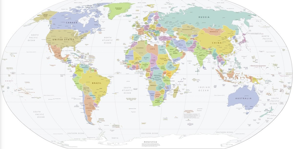
Political maps show human-created boundaries: states, cities, highways, congressional districts. Physical maps show natural features: mountains, rivers, elevation changes, climate zones. Most people need political maps and don't realize it.
A usa map showing state boundaries helps viewers understand territories, demographics, or administrative divisions. When a news outlet covers election results, they need state lines, not mountain ranges. When a company presentations market coverage, they need political boundaries to show which regions they serve.
Physical maps matter when geography drives the story. A hiking blog explaining Appalachian trail routes needs elevation data. A climate researcher showing precipitation patterns needs topographical information. A travel guide explaining why certain areas flood needs river systems and elevation.
The mistake: Using a physical map when your audience needs to understand political divisions, or vice versa. Your content determines which type serves your purpose.
Labeled vs blank: Template or finished product
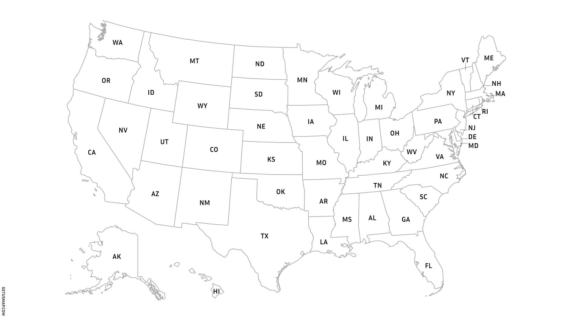
A labeled united states map shows state names, major cities, or other identifying information. A blank map provides just the outlines for users to add their own data. The choice depends on whether you're presenting information or asking others to interact with the map.
Teachers use blank us map templates for student exercises. Students label capitals, color code regions, or mark historical events. The empty outline becomes a learning tool where the filling-in process teaches geography better than studying a pre-made map.
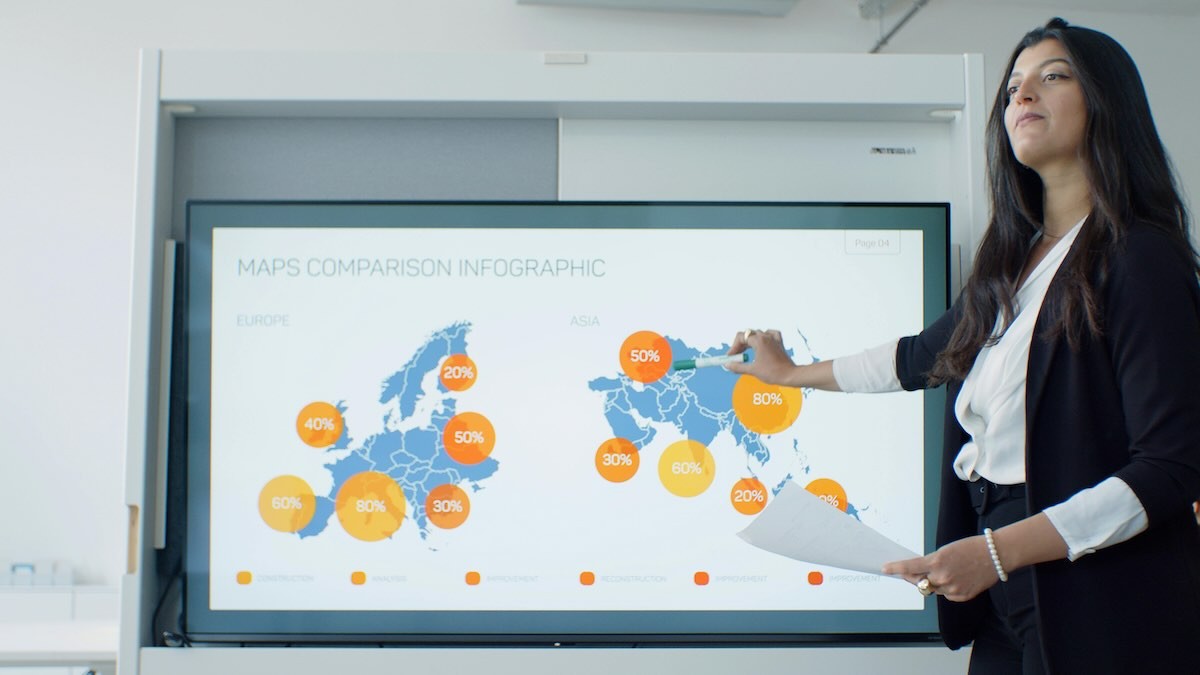
Business presentations usually need labeled maps. Executives showing regional sales data want state names visible so viewers immediately understand which territories perform well. Marketing teams presenting demographic information need city names so clients see exactly where their customers live.
Creative projects split both ways. A travel blog might use a labeled map to show readers exactly where adventures happened, but include a blank version for readers to plan their own trips. An app might start with a blank us map outline and let users add their own pins and notes.
File format breakdown: JPG, SVG, PNG explained
JPG: The universal choice
JPG files work everywhere—PowerPoint, web browsers, email attachments, printing services. They compress well, so file sizes stay manageable even for detailed america map images. Quality stays sharp for standard presentations and website use.
The limitation: JPG files have fixed resolution. Blow them up beyond their original size and they turn pixelated. Shrink them too much and details disappear. They work perfectly for predetermined sizes but don't adapt to unexpected display needs.
Use JPG when you know exactly how the map will be displayed: a specific slide size, a designated web page area, or a particular print dimension. Most business presentations and educational materials fall into this category.
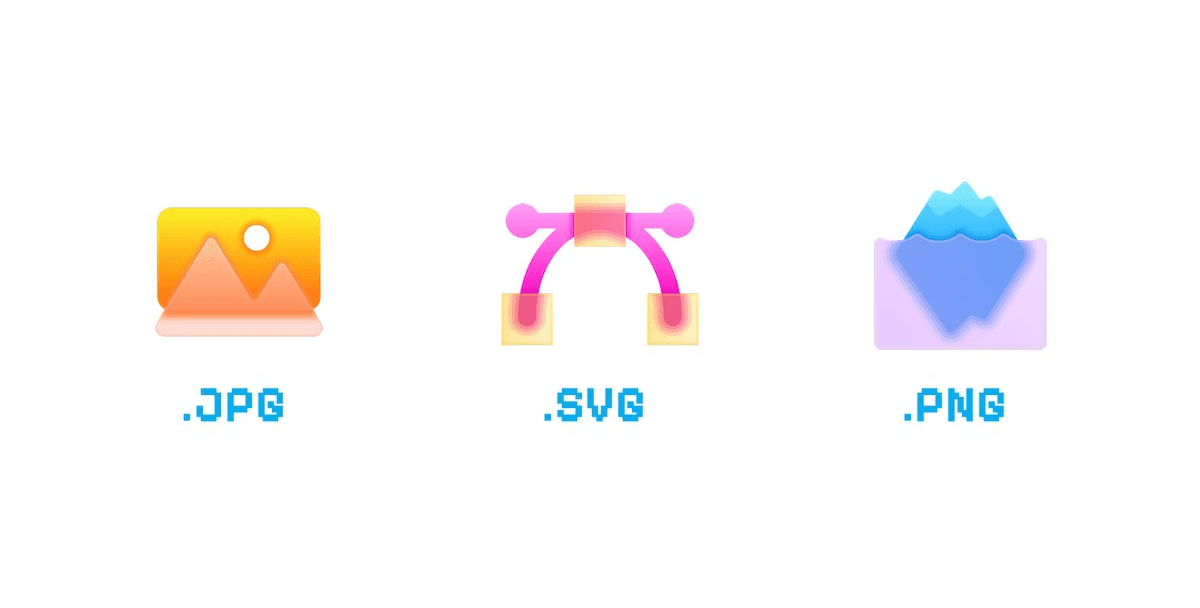
SVG: The professional standard
SVG files contain mathematical descriptions of shapes rather than pixel grids. Scale an SVG from business card size to billboard dimensions without losing any sharpness. Colors stay crisp, lines remain clean, text stays readable.
This makes SVG perfect for professional design work where the final output size isn't predetermined. A marketing agency creating materials for multiple formats—web, print, signage—uses SVG to avoid creating separate files for each size requirement.
The tradeoff: SVG files don't work in older software and some basic image viewers can't display them. They also create larger file sizes for complex maps with thousands of detailed elements like city names or county boundaries.
Choose SVG when visual quality matters more than universal compatibility, or when you need one file to work across multiple size requirements.
PNG: The overlay specialist
PNG files support transparent backgrounds, letting you layer a us map over colored backgrounds, photos, or other design elements without ugly white rectangles around the edges. They maintain better quality than JPG for images with sharp lines and text.
Web designers use PNG maps to overlay geographic information on existing page layouts. App developers use transparent PNG files to let background colors or patterns show through non-map areas. Presentation designers use PNG to place maps over branded slide backgrounds.
The downside: PNG files create larger file sizes than JPG, especially for photographs or complex images. They also have the same resolution limitations as JPG—they don't scale infinitely like SVG.
Use PNG when you need transparency or when image quality matters more than file size for web display.
Specialized US map types by scope and purpose
Geographic scope: What area do you actually need?
Continental US maps exclude Alaska and Hawaii, focusing on the 48 connected states. This works for most business applications since Alaska and Hawaii often function as separate markets with different logistics, regulations, or customer bases. A continental view provides more detail for the geographic area where most operations happen.
Full United States maps include all 50 states, usually showing Alaska and Hawaii as insets. Educational materials typically require complete coverage since geography lessons shouldn't ignore 20% of the country. International presentations often need the full scope to represent America completely.
Regional maps zoom into specific areas: map of eastern US, western territories, or multi-state regions like the Pacific Northwest. These work when your topic focuses on particular geographic areas. A company operating only in southwestern states doesn't need Maine cluttering their market analysis.
Purpose-driven map types
Transportation maps emphasize highways, interstates, airports, and shipping routes. Logistics companies use these to show delivery networks. Travel companies use them to illustrate route options. Business presentations use them to explain how products move between facilities.
Demographic maps display population density, age distributions, income levels, or other human statistics. Marketing teams use these to show customer concentrations. Political campaigns use them to understand voter distributions. Retail chains use them to identify optimal store locations.
Administrative maps show time zones, area codes, congressional districts, or legal jurisdictions. Law firms use these to show regulatory territories. Call centers use them to manage support regions. Political organizations use them to understand electoral boundaries.
Cultural maps reveal regional differences that political boundaries don't capture. Language preference maps show whether people say "pop," "soda," or "Coke" by region. Food culture maps display the most common restaurant types by state - pizza dominance in the Northeast, Mexican cuisine popularity in the Southwest. These maps help marketers understand cultural divisions that affect product messaging and regional campaigns.
Natural feature maps highlight national parks, rivers, mountain ranges, or climate zones. Tourism organizations use these to show recreational opportunities. Environmental groups use them to illustrate conservation areas. Outdoor gear companies use them to demonstrate product applications.
Did You Know?
Four Corners is the only point in the US where four states meet (Utah, Colorado, New Mexico, Arizona). You can literally stand in four states simultaneously at this surveyed intersection—a popular tourist destination that exists because 19th-century mapmakers wanted a clean mathematical boundary rather than following natural geographic features.
Kentucky's Kentucky Bend is a bizarre piece of geography—an 18-square-mile section of Kentucky completely cut off from the rest of the state and surrounded entirely by Missouri and Tennessee. This happened because the Mississippi River changed course after state boundaries were drawn, leaving this orphaned piece of Kentucky accessible only by traveling through Tennessee.
Geographic centers reveal how adding Alaska and Hawaii shifts America's balance point. The continental US center sits in Lebanon, Kansas—but when you include all 50 states, the center moves north to Belle Fourche, South Dakota. This demonstrates why Alaska and Hawaii are often shown as insets rather than to scale on national maps.
Louisiana's parishes instead of counties reflect the state's French colonial history. While the other 49 states use counties for local government, Louisiana kept the Catholic Church administrative term "parish" when it joined the Union in 1812, making it the only state with this unique local government designation.
Historical context: Why US maps look the way they do
Modern US map standardization emerged from practical necessity, not aesthetic choice. Early American maps varied wildly—different projections, inconsistent scales, conflicting boundary interpretations. Railroad companies needed compatible maps to coordinate cross-country routes. Telegraph operators needed consistent geographic references for message routing.
The Civil War accelerated map standardization as military operations required coordinated geographic information across vast territories. Generals moving troops from Virginia to Tennessee needed maps that matched in scale and reference points. This military requirement drove the first serious attempts at creating standard US map formats.
State boundary quirks reflect historical compromises, not geographic logic. Maryland's bizarre shape results from colonial land grants that prioritized river access over territorial coherence. The Four Corners region where Utah, Colorado, New Mexico, and Arizona meet exists because 19th-century surveyors wanted a clean mathematical intersection, not because natural features suggested it.
These historical decisions affect modern map design. Delaware's tiny size means it disappears on small-scale maps, requiring special callouts for visibility. Michigan's Upper Peninsula sits closer to Wisconsin than the rest of Michigan, confusing viewers unfamiliar with the historical reasons for this geographic separation.
Understanding these quirks helps explain why certain map designs work better than others. A map highlighting state-by-state data needs to account for size variations—Rhode Island requires different visual treatment than Texas to remain visible and readable.
Choosing the right map for your specific project
Business presentations: Territory and market focus
Sales territory maps need clear state boundaries with enough visual contrast to distinguish regions quickly. Use labeled political maps with distinct colors for each territory. Avoid physical features that distract from boundary information. Choose formats that remain readable when projected in conference rooms with varying lighting conditions.
Market penetration presentations require demographic context alongside geographic boundaries. Layer customer density information over state outlines. Use color coding that photocopies well for printed handouts. Include major city markers to help viewers orient themselves geographically.
Modern Geographic Information Systems (GIS) and interactive mapping tools have revolutionized business presentations. Teams can now layer real-time sales data over geographic boundaries, create heat maps showing customer density, and generate territory analyses that update automatically as data changes. These digital tools make static printed maps more powerful when combined with interactive dashboards for executive meetings.
Expansion planning maps need to show current operations alongside potential markets. Use different visual treatments for existing territories versus target areas. Include relevant infrastructure like major highways or airports. Choose file formats that work across multiple presentation platforms.
Educational materials: Learning through interaction
Geography lessons benefit from blank map templates that students fill in themselves. The process of adding state names, capitals, or regional labels reinforces learning better than studying pre-made maps. Provide both labeled answer keys and blank worksheets.
History projects need maps that can accommodate timeline information. Use simple outlines that don't compete visually with historical data overlays. Include enough geographic detail for context without overwhelming the historical narrative. Consider transparent PNG formats for layering over historical documents.
Classroom activities work best with high-contrast, simple designs that remain clear when photocopied or displayed on older projection equipment. Avoid subtle color variations that disappear in low-resolution displays. Use bold, readable fonts for any included text.
Creative projects: Visual impact and user engagement
Travel blogs need maps that complement photography rather than competing with it. Use clean, minimal designs that serve as visual anchors for text and images. Consider interactive elements where readers can click through to detailed regional information.
Marketing materials require maps that align with brand aesthetics while maintaining geographic accuracy. Custom color schemes should still provide enough contrast for easy reading. Balance visual appeal with functional information delivery.
App development needs maps optimized for small screen display. Prioritize essential information and remove decorative elements that don't serve user needs. Consider how maps will appear at various zoom levels and device orientations.
Finding quality maps that actually work
Most "free" maps online come with hidden restrictions that make them unusable for professional projects. Watermarks ruin presentations. Licensing requirements appear only after download. Resolution limitations make maps pixelated when resized. Educational use exceptions exclude commercial applications, even for nonprofits selling educational materials.
Commercial map providers charge significant fees for basic usage rights. A single high-resolution us map can cost $200-500 for unlimited use. Enterprise licenses reach thousands of dollars. Custom modifications require additional fees. These costs add up quickly for organizations needing multiple map types.
The alternative: truly free maps with simple attribution requirements. Download any format, modify as needed, use commercially—just include a link back to the source. This approach eliminates licensing uncertainty while providing professional-quality results.
GetUSMap provides exactly this solution: high-resolution maps in multiple formats with clear, simple usage rights. No hidden fees, no usage restrictions, no licensing complications. Just download the right map type for your project and include attribution.
Conclusion
The right US map choice depends on your specific project needs, not generic recommendations. Political maps for administrative information, physical maps for geographic context. Labeled maps for presentations, blank maps for interactive learning. JPG for standard use, SVG for scalable quality, PNG for transparent applications.
Match your map type to your content purpose. Consider your audience's technical capabilities and display requirements. Choose file formats that work across your entire distribution workflow.
Stop settling for suboptimal maps that almost work. Download the exact format your project needs and focus on creating great content instead of fighting with licensing restrictions.
Ready to get the right map for your project? Download our free US maps in JPG, PNG, and SVG formats. Need time zone information? Check out our US time zone map with all four zones clearly marked.